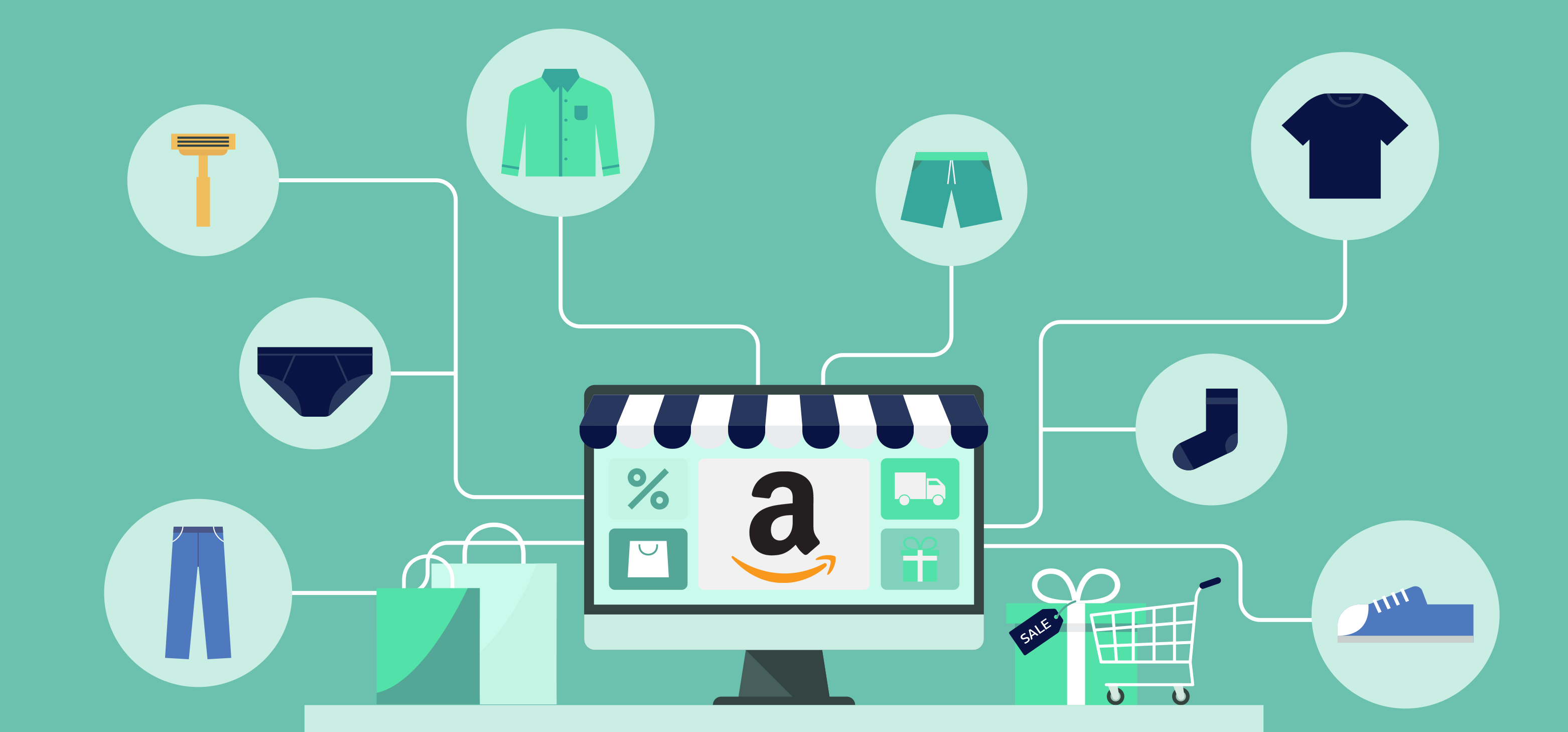
Amazon storefront is a recent marketing feature that gives you the opportunity to showcase your products exclusively.
It is a great place to get the undivided attention of your audience and establish your brand on Amazon.
I have got a few creative storefront ideas to help you use this feature to its full potential. With an optimized page, you can tap into 197 million monthly visitors and generate more leads to grow your business.
Explore these popular designs and start building your store!
But before we dive into them, let me share a few details about the storefront and what elements you can add to your page.
What is Amazon Storefront?
For all registered Brands, Amazon offers a separate space called a storefront to create your virtual store.
It’s the only place where you can freely advertise your products without another competing for your audience.
Think of it as your homepage. You can publish not only your product gallery for direct purchase but nurturing content to convert potential leads.
Amazon storefront is completely free and flexible enough that you can tailor it to match your business. Whether you’re a micro-niche brand or sell a diverse product line, you’ll find options to personalize your page layouts as you see fit.
Let me share what you can add to your store.
Amazon Storefront Elements
As I mentioned above, Amazon provides several presets to help you get started without coming up with new layouts. But, if you prefer to design your Storefront from scratch, you can also pick the blank page listed in the drop-down menu.
Should you decide to go for a preset, below are the sections you can add to your page.
- A top header image that best reflects your brand.
- Product title to let your visitor shop directly from your page.
- Interactive images with hotspot links to your products.
- Background video to visually enhance your page.
- Text tile to add attention-grabbing copy.
- Product gallery.
- Sales deal posters.
- Multiple pages into the storefront.
You can additionally add and remove any section you find unnecessary and change your existing layout to suit your purpose.
10 Amazon Storefront Designs & Examples
Below are some of the best Amazon storefront examples and ideas you can take inspiration from.
Let’s get started.
1. Repel Umbrella

Repel is a super micro-niche brand that exclusively sells umbrellas to its customers.
As Repel owns a single product, its storefront design is focused more on item information than the sales copy.
Take a look at the page, you’ll notice a theme. You’ll find product features right from the start with infographics to make its content digestible. Most of the page sections consist of clickable images to lead people towards the main product listing.
As you scroll down, you’ll also see an explainer video and a full catalog to shop directly from the store.
Repel is aware that as a micro-niche its target audience consists of those who will visit its store with an intention to buy its product and not merely to explore it.
The brand has used that knowledge to its advantage and has designed its Amazon storefront with that thought in mind, adding engaging features, item information, and a product gallery.
If your brand is a micro-niche, Repel storefront is an excellent design for inspiration.
2. Anrabess

Anrabess is an online apparel store that generates most of its income from Amazon.
As a fashion brand, Anrabees major selling point is its outfit style.
Since people typically prefer fewer yet trendy sweaters that go along with most of their outfits, Anrabess has created its storefront around its customer’s shopping behavior.
It has used storytelling skills to systematically place style guides, brand stories, and classic images to make its content look like a narrative. It has additionally highlighted its best-selling product to boost its brand appeal to new customers.
This type of storefront design works well for small businesses that sell non-essential items.
3. Pandora

Pandora is a multinational jewelry brand that specializes in personalized charm bracelets. It strives to inspire love, care, and personality and has employed the same brand value to its Amazon storefront as well.
If you scroll through its page, you’d notice it has a fairly simple two-section layout but has cleverly combined color and copy to highlight its product’s features.
It has applied pink as a storefront color theme to accentuate its female exclusive niche and added personalized text to underline its brand message. It wanted to tell the world you can express yourself with your jewelry and used a minimalist narrative to accomplish it.
That’s what makes its storefront design stand out.
4. Dash

Dash is a kitchen appliance brand whose core features are its product size, ease of use, and item color. Since already a dozen are selling similar items on Amazon, Dash highlights its product visuals to stand apart from its rivals.
Take a look at its storefront. There’s hardly any text published on the page.
The entire page layout consists of both eCommerce and hero shots side by side with matching background colors to pop up the products. The only constant text you’ll find on the page is the item prices.
The brand has focused entirely on visuals, and it follows seasonal color themes to attract its audience.
If you sell household products, this layout structure will work well for you.
5. iOttie

iOttie is a cellphone accessories brand that focuses on improving the outdoor experience with wireless appliances.
As a premium brand, iOttie has employed a classic minimalist theme to emphasize quality and relevance to automobiles.
You’ll find a repetitive pattern in its layout comprising mainly of clickable hero images and videos. The header image contains all its products with a plain background, followed by the main image in a contrasting color.
The rest of the page tiles are divided into two to four sections published by category.
Unlike Dash, you’ll notice iOttie has not mentioned prices. That’s because it wanted to imply it’s a luxury brand. It has instead put all its efforts into exhibiting its products.
iOttie’s design is best suited for luxury men’s brands.
6. Blue Sky LLC

Blue Sky has an extremely intuitive storefront.
If I had to describe it in one word, I would call it a “well organized” page.
Just like its product, Blue Sky’s store is carefully planned into neat sections to make navigation easy for its prospective customers.
As you visit the page, you’ll be welcomed with a banner image showcasing a diverse collection of notebooks.
On the menu, Blue Sky has separated professional planners from fun and flower styles to let you know exactly where you can find what you’re looking for.
It has given the same thought to its product details to help you make an informed decision without needing to go through the entire list of features.
Its storefront is possibly the best example of how you can create a page that reflects your products.
7. Lovevery

Lovevery is an educational toy brand whose competitive advantage is its sales copy and colors. To leverage that information, Lovevery uses a lot of white space to call attention to the colors and the text.
Its banner image is on a white background to pop up the different shades displayed at the top. As you scroll down, you’ll find white space after every colored tile to accentuate both the text and the product.
Lovevery also repeatedly mentions the word “expert” across to establish trust. That’s because parents typically buy educational content from stores, which they believe offer quality and are trustworthy. It has used all the ingredients in its Amazon storefront to attract that audience.
Overall, it’s a good design for kids brands.
8. iRobot

If you ever saw an AI vacuum robot, what would be the first thought that would come into your mind?
“You mean it’ll automatically clean my lounge? Great! But how?”
iRobot has designed its storefront to answer your queries first and showcase the product later. It has the best page layout for brands with a unique product line.
As you enter the store, you’ll find a background video showing you how the vacuum cleaner works. Most people are familiar with the workings of common items.
But if your product falls into the tech category or requires a tutorial, a background video at the start of the page will improve the user experience and decrease your bounce rate.
iRobot targets its leads with persuasive copy, educational video content, and images that resonate well with its audience.
Therefore, despite having a fairly simple storefront, every iRobot item exhibits a four to five digit number of items sold.
9. ANYOO

If video is not what you can create at the moment, ANYOO store provides the best way to explain your product features.
ANYOO is a hammock seller that offers versatile indoor and outdoor product lines.
To help its visitors shop for the right item, ANYOO uses a three-section structure to display the items. If the cotton hammock is for indoor purposes, you’d see an image showing how it will look in your lounge along with two other products.
If you want a hammock for your beach gathering, you’ll find the product items next to a beach palm image.
This page layout works really well for items that are familiar but still require a guide to make an informed decision.
You can also add your product gallery at the end of the page to exhibit all items in one section separately if that’s what you believe your target audience would prefer.
10. Zesty Paws

Zesty Paws is a pet supplement brand that sells healthy immunity boost treats. What makes its Amazon storefront successful is the consistency it keeps across multiple marketplaces.
Zesty Paws uses a distinct orange color scheme to represent both health and fun and plays with shades to attract its target market, making its brand memorable and easy to discover.
You’ll find it everywhere, in its products, logos, website landing pages, sales copy, and advertisements. It applies the same color theme to its Amazon storefront, leaving no doubt the page belongs to it.
Unique color themes increase 80% chances of brand recognition. If your brand has an attention-grabbing color palate, use it for your Amazon store as well, for better results.
Graphic Rhythm – An Excellent Design Service for Amazon Sellers

Now that you’ve gathered a general idea of how you can best use page space, you should start planning on storefront graphics.
Almost all the brands I have mentioned above have used some graphics to refine their storefront.
Why?
Because irrespective of your business nature, you’ll need graphics to add a professional touch to your store.
While visually appealing images are enough to attract customers, a polished image will boost your brand authenticity, ultimately increasing your sales conversions.
There are two ways you can acquire graphically enhanced images. You can subscribe to Adobe services and use Adobe Illustrator for your project.
If you can’t spare time to do it yourself or aren’t familiar with the tools, you can opt for third-party graphic designing services to do it for you.
Graphic Rhythm is one of the digital service agencies that offer a complete Amazon graphics package to sellers looking to improve their storefront appearance and copy.
It follows a well-structured process consisting of researching your target market, discovering the emotional connection with your brand, and turning that data into graphics.
Furthermore, it has in-house copywriters to optimize your product listing with conversion-optimized storefront design.
Here’s a summary of its core features.
- Full Amazon storefront design optimized for more sales and UX
- Main and supporting gallery images.
- Infographics.
- A+ content to cover copy and product listing.
- Relevant keywords to help you optimize your storefront.
- Complete done-for-you service
Pricing
Graphic Rhythm charges different prices based on your specific design requirements. Check out their Amazon Storefront design plans here.
Conclusion – Creating Your Amazon Storefront
I am wrapping up the article with the basic instructions on creating your storefront.
If you’re ready to build your brand page, go to the store on your dashboard, and click on the brand you’ve registered on Amazon. It will ask for the brand name and logo before moving to the builder.
Once you’ve gained access to the builder, you can choose the layout of your choice. The page is split into sections to make it easier for you to add images, videos, and text in any way you like.
You’ll additionally get a space on the right side to add your meta description for Google.
I have posted the Amazon storefront tutorial by Jungle Scout above to help you along the way.
So, select your template, explore the graphic designing options, and start building your page.
Just remember, you can only create one storefront for your brand. Give it your best shot!