A solid conversion marketing plan can help you better understand your website visitor’s behavior and use that knowledge to generate more leads.
With an effective CRO strategy, you can remove obstacles hindering your click-through rate and get the most out of your landing pages.
In this article, I have put together some of the best conversion marketing examples for your inspiration.
Explore how brands are optimizing their sites and uncover versatile techniques to turn your existing leads into paying customers.
Let’s dive in!
1. Trucker’s Report
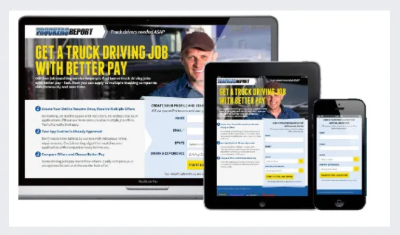
Trucker’s Report is a private community forum for drivers where they can get assistance from seasoned truckers, find new job opportunities, and build their network.
A while back, Trucker’s Report wasn’t generating satisfactory conversions despite getting a large volume of traffic on their site. After auditing the landing page, it discovered the problem wasn’t content usability; it was simply too generic to persuade its audience to pursue it.
It changed its headline, altered the form design, and replaced the background image, resulting in a 79.3% rise in conversions.
TakeAway
Eight out of ten people look at your page title and images before they scroll down to read the copy.
By focusing on these elements, you can make a strong impression of your brand and generate more leads.
2. Lead Guru
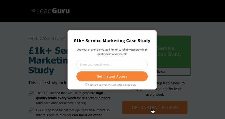
Advertising agency Lead Guru previously used static opt-in forms for gated content to convert its site traffic.
Although it was performing well, Lead Guru wanted to improve its click-through rate to drive maximum results.
To make it work, it replaced the static form with a Lightbox pop-up and added a trigger button in the visible area.
The form re-design boosted its engagement by 26% and increased its conversions by 81.8%!
TakeAway
Trigger-based pop-ups are highly effective for two major reasons.
- They instantly grab your audience’s attention.
- They offer a distraction-free experience.
3. Nature Air

Nature Air, back in 2008, faced a terrible hit on its sales in the face of the recession and wanted to see if it could boost its declining sales through conversion optimization.
After A/B testing several landing pages, it learned that putting a CTA parallel to the body text block may get more clicks.
Placing their call-to-action button to the desired area, Nature Air successfully increased its conversions from 3% to 19%.
TakeAway
The placement of your CTA is more important than the button itself. If you sell a technical product, the call-to-action button above the fold would likely distract your visitors. If you place it at the end of the page, you risk losing leads.
Align your CTA with your copy to provoke action timely.
4. Kiva
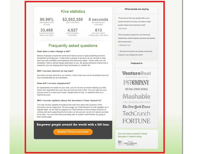
Kiva is a microfinance company that targets potential entrepreneurs from impoverished backgrounds looking for a way to start a small source of income.
While its site attracts a large volume of traffic, it still needed help with the sign-up rate.
After running an analysis, Kiva realized insufficient information might be behind low sign-ups since most of its visitors are not familiar with the loan process.
Taking it into account, it added an FAQ section on its landing page, and the upgrade boosted its conversions by 11%.
TakeAway
The FAQ section is the second most visited page people visit to learn more about your product and services.
It offers you a great opportunity to improve your visitor’s experience and link to your product pages to generate qualified leads.
5. SnackNation
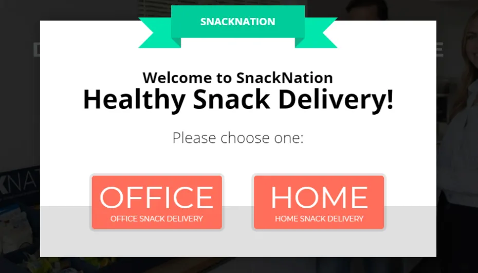
SnackNation is a meal subscription company that caters to two different markets.
To provide a personalized experience to both, it choose the pop-ups format for a targeted campaign.
Publishing a series of welcome and exit op-ins, SnackNation segmented its traffic market at the start of the journey and converted them through gated content offers.
With this move, it collected 1200 emails and captured 31.85% of leads.
TakeAway
Customer segmentation helps you create custom campaigns to target your prospective buyers better. It allows you to share only relevant content with your visitors and improve the user experience.
6. Divorce Online

Divorce Online has been providing legal services to its clients since it started its operations in 1999.
But while it enjoyed a good reputation, it eventually felt the need to improvise its strategy when the competition started to drive its sales down.
To increase its sign-up rate, Divorce Online focused on its audience queries and simplified the entire copy to make it clearer and related.
It worked surprisingly well, and DO grew its revenues by 50%.
TakeAway
Writing your copy around your target market’s pain points can help you build an emotional connection with them.
It lets people know you have the solution to their problem and drives them to explore your product and services.
7. Buy a kilt

Buy A Kilt (now kilt Society) sells a diverse range of products and divides its items into several categories to make navigation easy.
While its product line wasn’t as extended as you’d see in a typical commerce store, Buy A Kilt thought adding a product filter would yield more sales.
To test out its theory, it included a filter on its product page, and, remarkably enough, revenues spiked by 76%.
TakeAway
Product filters save your visitors time by helping them quickly find what they came here to explore. It improves user experience and increases the visibility of your products, ultimately generating more leads.
8. Irreverent Gent

Men’s lifestyle blog, Irreverent Gent uses a clever FOMO copywriting trick to persuade visitors to sign up for its newsletter.
Instead of adding a countdown or limited offer, it employs social comparison to create a sense of urgency in its audience.
The above image is a screenshot of their opt-in forms displaying a heading highlighting its FOMO tactic.
When Irreverent Gent published the above newsletter form, it received an instant 17% boost in its conversions.
TakeAway
The fear of missing out is a psychological phenomenon that provokes people to make impulse shopping. It is a widely popular strategy that tons of brands practice to maximize their revenues.
9. GoCardless

Online payment collection company GoCardless, added a DEMO request on its landing page to persuade people to buy its products. But something in its copy was sinking its click-through rate.
After an initial evaluation, it found out the CTA phrase “Request A Demo” might be making its visitors reluctant to click on the button.
To test the theory, it swapped the original CTA with “Watch A Demo” and received a 139% boost in conversions.
TakeAway
GoCardless’s case study shares incredible insight into the powerful effect of action words.
By changing its CTA copy, it removed the feeling of hesitation and improved its click rate.
10. SuperPuzzle
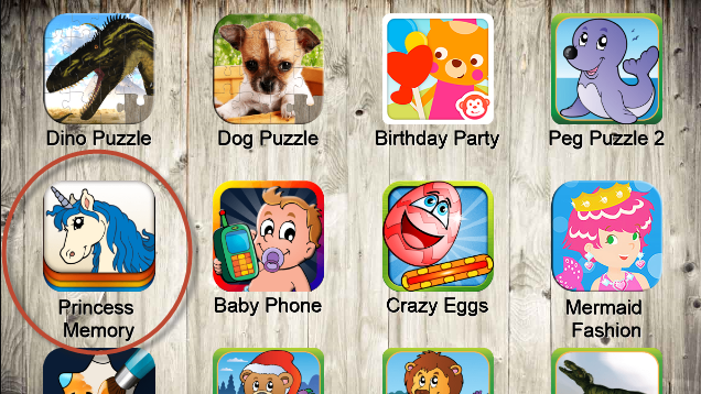
SuperPuzzle is a jigsaw puzzle app that offers simple yet visually appealing games for kids’ entertainment.
Most of its games received satisfactory conversions, but its “Princess Memory” was the only one that showed the highest downloads.
After checking the traffic stats, the developer discovered that 66% of its users were women and that they might have been attracted to the game because of the unicorn Icon.
He swapped the main icon for Unicorn and doubled its daily downloads.
TakeAway
SuperPuzzle’s sales growth might seem like a stroke of luck, but its developer hit the mark correctly. Your icon is the first thing your audience sees on App-store, and it’s what influences them to check out your app.
11. Laura Roeder

Laura Roeder is a social media strategic coach that teaches entrepreneurs how to leverage social media to grow their business.
The example here shows how she improvised her landing page heading to persuade them to sign up for the newsletter.
The original copy had a “Could You Use a Free Plan for Promoting with Social Media?” heading.
By updating it to “Yours is the only newsletter that I actually read,” she invoked curiosity in its visitors and increased sign-ups by 24.31%.
TakeAway
Catchy headlines generate high responses because of their novelty value. The unconventional message draws instant attention and creates an urge to take impulse action.
12. VagasSlotOnline

VagasSlotOnline wanted to stir the same sense of excitement in its visitors they typically experience while using a physical slot machine to generate more sales.
But since a website typically comes with geographical segmentation, it instead targeted casino colors and applied them to its CTA buttons.
When it replaced the original green with the traditional yellow, VagasSlotOnline gained a massive 175% boost in its conversions.
TakeAway
Colors play an important role in business because of their significant influence on people’s actions.
In the VSO case, the yellow shade created the thrill of gambling and made its audience feel energetic enough to try their hand at an online casino.
13. OffSpring

OffSpring’s case study is an ideal example of how a mobile-friendly site could positively impact your sales.
The retail store had a well-structured online website, but it was not built to support mobile devices. When OffSpring realized it was declining both its sales and Google ranking, it revamped its site and adopted a responsive design.
The improved version lifted its mobile sales by 102% that year.
TakeAway
People nowadays generally shop through their smartphones. With a mobile responsive site, you can make it easier for your prospective customers to buy your product and services.
14. CrazyEgg

CrazyEgg offers heatmaps to help its clients monitor their site visitors’ behavior.
While it currently enjoys a good reputation, in its early years, it struggled to generate leads because of the technical nature of its product.
With the assistance of CRO experts, CrazyEgg created animated explainer videos to both educate and entertain its visitors. The campaign was a major hit, and its conversion went up by 64%.
TakeAway
An animated explainer video allows you to describe your product and services succulently to your prospective customer. It keeps your audience engaged through a series of entertaining clips and conveys your message effectively.
15. Alwin Hoogerdijk

Did you know a simple smile can affect your sales?
Alwin Hoogerjisk, the founder of Collectorz.com, didn’t know it until a fleeting comment over his “angry dude” facial expression made him consider its significance.
He had a cover image of himself on his landing page for two years when, on the advice of his fan, he re-took his photo with a smile on his face and replaced the image.
After five weeks, Alwin noticed a sudden rise in sign-ups and generated a 10% increase in profit.
TakeAway
Images with a smile make your brand appear down to earth and more approachable. It leaves a positive impact on your visitors’ minds and influences their actions.
16. Voxpopme
Voxpopme offers its clients an affordable way to get quick insights through video surveys.
Unfortunately, its lead generation strategy wasn’t user-friendly, and the delayed response on its visitor’s forms was hurting its sales.
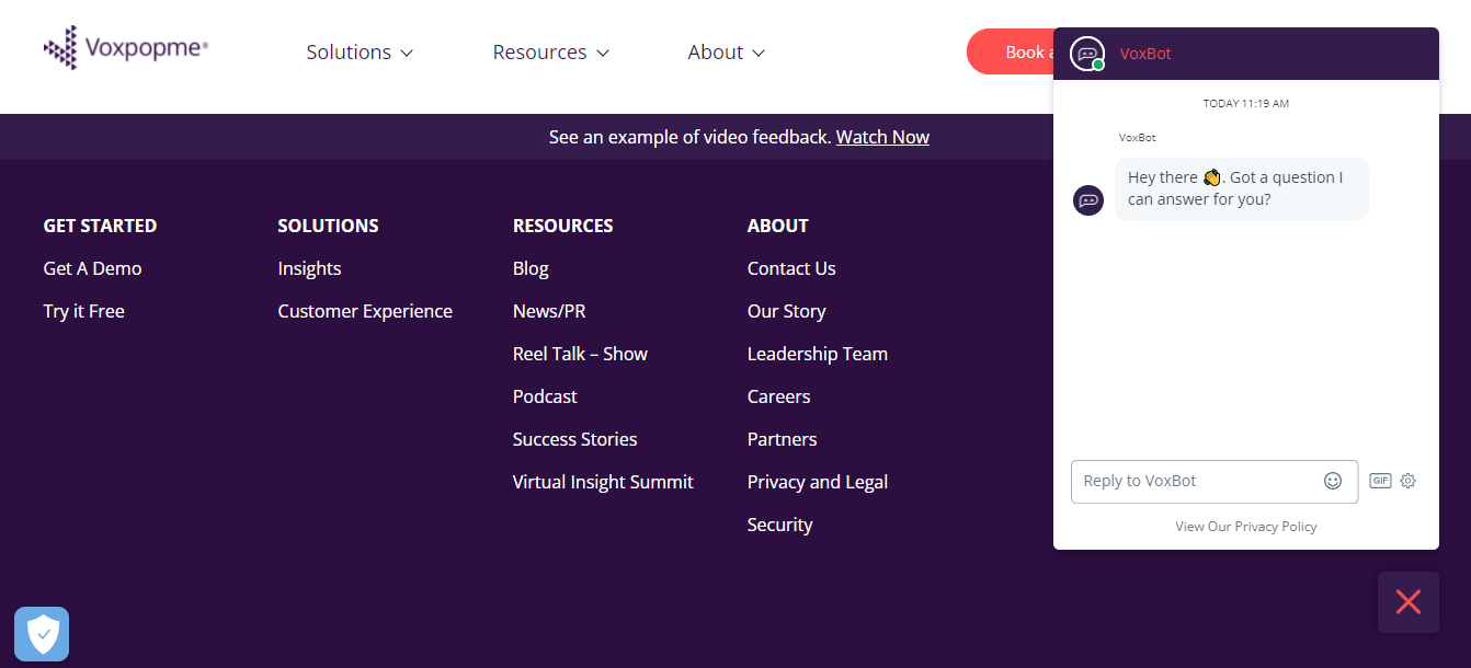
Voxopopme solved the problem by adding a chatbot to their site.
With the help of automated messages, it bridged the communication gap and doubled its conversions.
TakeAway
68% of people prefer chatbots because it gives them quick answers to their queries.
It’s a time-saving feature that improves your response rate, offers a personalized experience to site visitors, and engages multiple people simultaneously.
17. 123FormBuilder

123FormBuilder has been investing heavily in customer acquisition strategies but wasn’t satisfied with the results.
Although its lead generation campaigns were performing well, it struggled to increase its sales.
When 123FormBuilder tested its site, do you know where it located the problem?
The price page table.
Remarkable, isn’t it? It wasn’t the headline, copy, or CTA that were hitting sales. It was the table format!
With a slight change in table design, its conversions went up by 21%.
TakeAway
Your price page is the critical stage of your funnel where you finally turn your leads into paying customers.
The more reader-friendly your page is, the better are the chances of influencing your prospective buyer’s decision.
18. Cookie’s kids
Cookie’s Kids is a brick-and-mortar department store that also offers online shopping options to its customers.
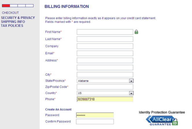
But since online purchases risk data leakage, it wanted to represent itself as a trusted source to convert more leads.
It identifies areas where its visitors would likely need reassurance and publishes trust seals on their respective pages.
The new addition helped boost its organic sales by 30%.
TakeAway
Trust seals and security badges add credibility to your site. People would likely buy your product if they think your brand is authentic, and the information they share will be protected.
19. Oflara
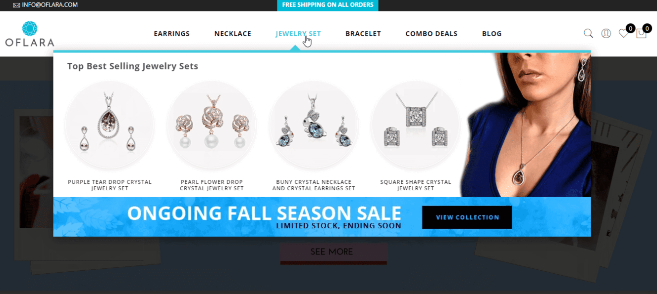
Oflara is a small jewelry business that sells a limited collection of products and has to rely on its visual content to attract its audience.
To improve the user experience, it experimented with its navigation UI and added an interactive feature in each category.
Its original menu took visitors directly to the relevant page, while the new style showed a drop-down menu featuring bestselling products before leading to the main page.
The upgraded version proved successful, and Oflara increased its revenues by 53% within a week.
TakeAway
Interactive web designs uplift your site’s aesthetic appeal and provide a memorable browsing experience to your visitors. It leaves a good impression of your brand and attracts more leads.
20. Numerologist

Numerologist offers astrology-driven predictions and life advice worldwide.
Because of the holistic nature of the business, it was losing some leads at the end of the funnel. The issue appeared to be a lack of trust in the product, making people reluctant to complete the transaction process.
Identifying the root cause, Numerologist added a video testimonial on the checkout page, and it climbed its sales by 30%.
TakeAway
Testimonial publication is a marketing technique that adds weight to your business credibility. It offers social proof of your brand, letting people know they can trust your products.
Before you start adopting any of the above tactics, perform A/B testing to make sure it is the right strategy for you.
